Showing posts with label Hipgnosis. Show all posts

Friday, 14 July 2023

Squaring The Circle - the story of two of the most important figures in rock history

Aubrey ‘Po’ Powell and Storm Thorgerson
Picture: Hipgnosis

To men of a certain age – and it is, almost exclusively men – album covers are, or at least were, a big thing. They probably still are, but it’s actually hard to think of the last time you heard of an album cover making headlines in the age of streaming.

There was a time, though, when an album cover was almost as significant as the music contained on the vinyl within. Earlier this year I interviewed journalist Mark Blake about his book Us And Them, which tells the story of arguably the greatest purveyors of album design, Storm Thorgerson and Aubrey ‘Po’ Powell – collectively the design house Hipgnosis. Their work between 1968 and 1983 produced, most famously, the artwork for Pink Floyd (including their opus The Dark Side Of The Moon), but also more than 250 sleeves for artists as varied as Led Zeppelin, Paul McCartney, Peter Gabriel, Humble Pie, 10cc, Leo Sayer, Genesis, ELO, Black Sabbath, Olivia Newton-John and XTC. “The Hipgnosis story kind of follows the arc of the LP, and the LP ‘taking over’ from the single as the primary focus of bands,” Mark told me. “[The Beatles’] Sgt. Pepper’s Lonely Hearts Club Band was a game changer in that sense. So, their career follows the art where the LP was king.”

That career is now the subject of a film by Dutch director and photographer Anton Corbijn, himself responsible for iconic album art of his own, having been most closely associated with Depeche Mode and U2, as well as taking iconic images of everyone from Robert Plant and Jimmy Page, Bob Dylan, and Bruce Springsteen to Robert De Niro and Clint Eastwood. 

Squaring The Circle, Corbijn’s debut as a documentary maker (having previously made dramas like Control, about Joy Division’s Ian Curtis and The American with George Clooney), pays homage to trailblazing legacy of Thorgerson and Powell and how they took the concept of cover art - which, for most of the pop era had largely been portraits of the bands - to conceptual pieces of art which complimented or even extended the often progressive, lyrical nature of music they enveloped.

With archive clips of interviews with the late Thorgerson, narration throughout by Powell (who brought the idea for the film to Corbijn) as well as new interviews with the likes of Pink Floyd’s David Gilmour and Roger Waters, Sir Paul McCartney, Led Zeppelin’s Robert Plant and Jimmy Page, Noel Gallagher and Peter Gabriel, the documentary expands on the studio’s work amid the context of rock counter-culture.

Peter Gabriel’s first three, Hipgnosis-designed albums

“There was an enormous amount of goodwill towards Hipgnosis,” Corbijn told The Guardian recently about the involvement of many of Thorgerson and Powell’s muses. “People just wanted to make [the film] work. They were generous. Everyone was proud of their albums and the work they had done with them.”

“Growing up in the late ’60s and ’70s, I was obsessed with music and everything connected to it – especially the album covers,” Corbijn says as a pretext to the film, adding that “record sleeves were a huge part of my education. I clearly recall the moment I first saw the sleeve for Atom Heart Mother by Pink Floyd, and the Peter Gabriel sleeves [whose first three solo albums were untitled save for his name and an iconic image]. They just blew me away and this led me on a journey of discovery towards Hipgnosis, who designed these and some of the most memorable sleeves from that time.”

Without doubt, The Dark Side Of The Moon looms large in that pantheon, with Thorgerson and Powell knowing Pink Floyd since their school days together in Cambridge, before moving to London. “Hipgnosis were unique in these early days and they set the bar very high,” says Corbijn.

Thorgerson was very much the ‘ideas’ half of the duo, while Powell, a photographer, had a more instinctive, snappers approach. When combined with the creative freedom they were afforded by bands and their record companies, the gallery of Hipgnosis’ output deserves a chapter of its own in the history of popular music. “They conjured into existence sights that no one had previously thought possible,” says Corbijn. “They produced visuals which popularised music that had previously been considered fringe, and were at the white-hot centre of the maddest, funniest and most creative era in the history of popular music.”

Hipgnosis at work, 6 Denmark Street, London
Picture: Hipgnosis

Album sleeves, he says, during this period became a force in their own right. “In the ’80s, of course, we got CDs, so the album sleeve sort of deteriorated, and the art with it, Corbijn adds, saying that, as a photographer, he was drawn to Hipgnosis’ work by the images they used. He marvels at how they created works of art: “Before we had all the intricate things we can do now on the computer, they did it with a knife and glue, and pieces of paper,” he recently told Collider. “They made really incredible collages and made the impossible possible.”

As the film reveals, Thorgerson and Powell often went to great lengths - and expense - to produce their album art, notably the images for Pink Floyd’s Wish You Were Here album and, of course, the ‘flying pig’ cover for that record’s follow-up, Animals. It’s this ambition that inspired the documentary’s title. “‘Squaring the circle’ means doing the impossible, but it also represents the circular record going into a sleeve, Corbijn explained to The Guardian.

“One of the craziest things - it’s also in the film - is a sleeve for 10cc [for the Look Hear? album],” Corbijn recalled to Collider. “They saw the idea of having a sheep on a couch in a beautiful ocean. So they went all the way to Hawaii, not realising [there were] no sheep in Hawaii, and there were no [psychiatrists’s] couches either. So they had a couch made, and they had one sheep, they found one sheep at the university, and they managed to give it a lot of Valium and shot it.”

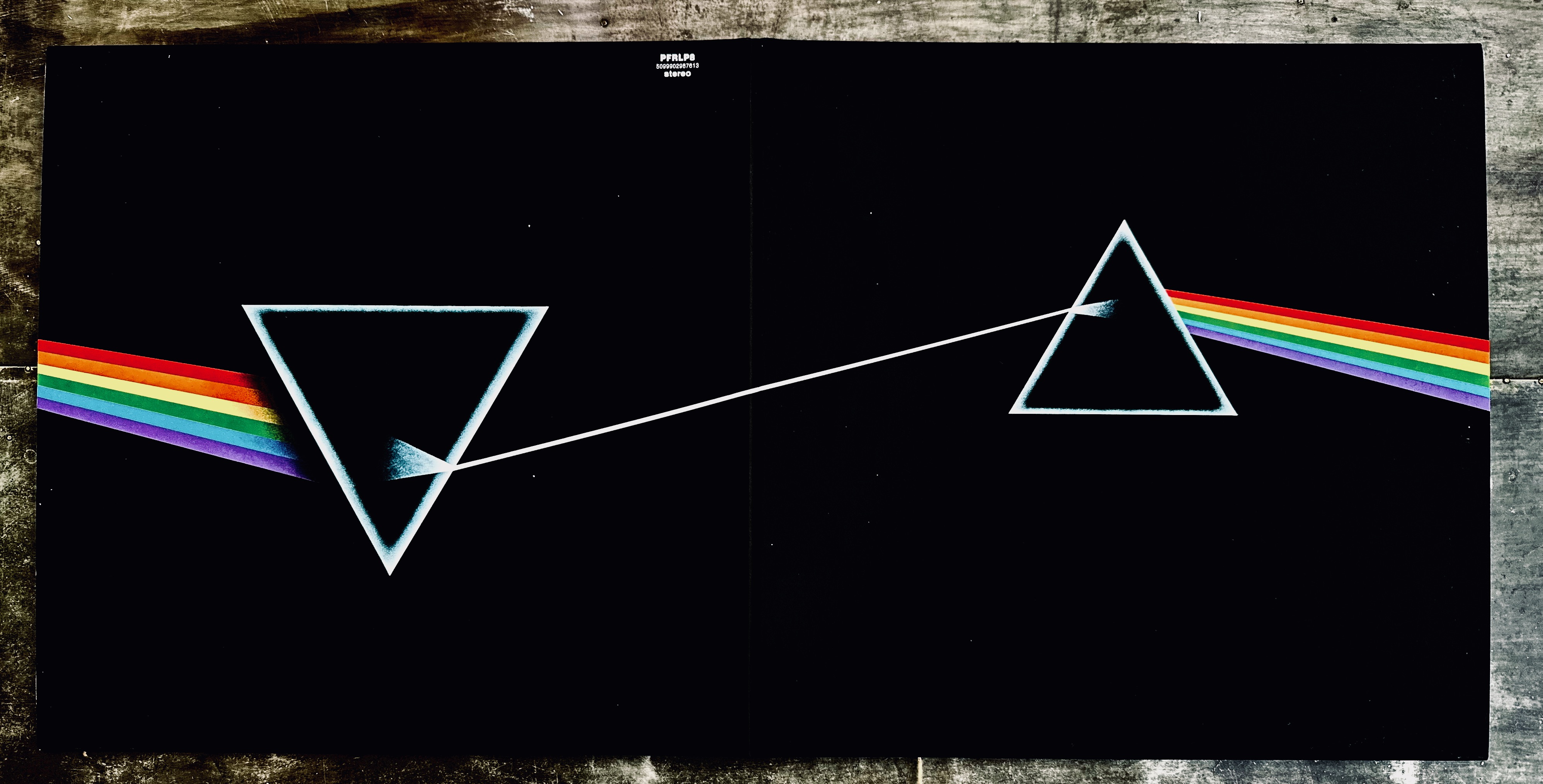
While Noel Gallagher quips in the film that album covers represents “the poor man’s art collection”, there’s no escaping the fact that Hipgnosis have produced some of the most recognisable images of all time, with The Dark Side Of The Moon’s light-entering-a-prism seared in culture (receiving no more prestigious a nod to the zeitgeist than being parodied in an episode of The Simpsons). “I think both of them have a complicated relationship with  Dark Side,” Mark Blake told me earlier this year. “It’s not their favourite work, but it is their most famous work. I don't think it's a very simple design, and it doesn’t have the narrative quality to it as Wish You Were Here did a couple of years later, which I think was certainly one of Storm’s favourite Floyd covers.  So, I think they're both a little bit conflicted about Dark Side, really.”

For his film, however, Anton Corbijn had to negotiate around the frail relationships that exist between the surviving members of the band, most notably the fractious dynamics between founder member Roger Waters and guitarist David Gilmour, who joined in 1967 as co-founder Syd Barrett’s behaviour became ever-more erratic. Barrett himself makes a brief appearance in Squaring The Circle, in a poignant moment when Powell recalls an overweight and almost unrecognisable Barrett visiting Abbey Road studios in 1975 during the recording of Wish You Were Here, by then succumbing increasingly to poor physical and mental health. It is, apparently, a moment that continues to move the band’s remaining members.

Hipgnosis images used for Pink Floyd’s Wish You Were Here album

“I guess everybody knows they have four managers these days – for every member there’s a manager,” Corbijn semi-joked to Collider with typically understated Dutch humour. “But I guess the love for Hipgnosis overrode all that, and they wanted to be part of this. I mean, they were not in the studio at the same, but they all said yes to it in the end.”

Pink Floyd, in particular, gave Thorgerson and Powell a platform. Their abstract, obtuse and often ethereal concepts led them to other exponents of early ’70s progressive music, like Wishbone Ash’s Argus, which in turn led to Led Zeppelin’s Jimmy Page inviting Hipgnosis to design the House Of The Holy sleeve (which depicted Northern Ireland’s Giant’s Causeway). That, then, attracted Paul McCartney’s attention, bringing the studio in to realise his concept for Wings’ celebrity-themed Band On The Run cover.

“I hope people see it as a fun documentary, as well as an educational one, regarding that period of music and graphic design,” Corbijn says of Squaring The Circle. However, it also addresses how the Thorgerson/Powell partnership came apart. Having moved to London during the 1967 ‘Summer Of Love’, the duo shared a South Kensington flat, first using university facilities to build their reputation for art (including their debut for Pink Floyd, A Saucerful Of Secrets in 1968) before opening the Hipgnosis studio at 6 Denmark Street - London’s musical mecca known as ‘Tin Pan Alley’. 

But by 1983 - a year after the launch of the CD - Hipgnosis as, largely Thorgerson and Powell (along with often forgotten Peter Christopherson) - they decided to call it a day. Powell addresses this in the film, breaking down in the process, much to Corbijn’s surprise. “I didn’t see it coming,” Corbijn says of the scene. “It was a beautiful moment in the film. He clearly misses Storm terribly.”

Po and Anton
Picture: Anton Corbijn

As much as Squaring The Circle celebrates an era of album covers that broadly paralleled the rock era itself, it also marks the decline of an art form, first by the introduction of the Compact Disc in 1982 (Hipgnosis gave up album design in 1983 and switched to making music videos) and more recently, by the advent of streaming. It’s a point Noel Gallagher makes in the film, highlighting the lack of appreciation for album covers shown by today’s younger consumers, which may be the result of both record companies trimming their artwork budgets, and the thumbnail formats of streaming platforms making the impact of album cover art negligible. “The importance of the record sleeve has diminished,” Corbijn agrees. “In the ‘70s, for young kids there wasn’t much else to spend money on. Yet you had to save up to buy something, so it was meaningful. Now nothing is meaningful because you can get it at the touch of a button.”

Squaring The Circle opens today in UK cinemas and via streaming services. It also be released as a collector’s edition Blu-ray Disc on 7 August.

Arc Of A Diver, my post on Mark Blake’s biography Us And Them can be read here.


Saturday, 28 January 2023

Art of a diver

Just beyond the eastern extreme of California’s Yosemite National Park, not far from the border with Nevada, sits Mono Lake, a salty body of water formed three-quarters of a million years ago. I came across it considerably more recently than that - 1992 to be exact - but at the time had no appreciation of the cameo it had made in my musical adolescence when I stopped there for what Americans politely term a “comfort break”.

For context, I was midway through a month-long tour of the American West, albeit in December when the tourist hordes are elsewhere. Having driven from Los Angeles up the Pacific Coast Highway to San Francisco, and then north-east to snowed-in Lake Tahoe, I was heading south towards Death Valley along the scenic Highway 395, with California’s spinal Sierra Nevada mountains to my right. Just south-east of Yosemite, I came across Mono Lake and its seemingly abandoned visitor centre. Making use of its facilities, I then took in a view of the lake’s eerie stillness, framed by unique tufa formations. It would be another 25 years - and several visits further to that part of California - before I’d come to realise where I’d seen that tufa before. On a display wall at London’s V&A museum, as part of the Pink Floyd: Their Mortal Remains exhibition, was a blow-up of the inner sleeve of the band’s ninth studio album, Wish You Were Here, depicting a perpendicular diver performing a handstand in, yes, Mono Lake. 

The image was the idea of Aubrey ‘Po’ Powell, the photographer and co-founder with Storm Thorgerson of the Hipgnosis design studio which, from the end of the 60s to the beginning of the 80s produced some of the most distinctive album covers ever committed to 12 inches-square of cardboard. Over 15 years, they produced more than 250 sleeves for artists as varied as Led Zeppelin, Paul McCartney, Humble Pie, 10cc, Leo Sayer, Genesis, ELO, Black Sabbath, Olivia Newton-John and XTC, as well as Pink Floyd, with whom they became most closely associated.

It’s the perfect subject, then, for Us And Them: The Authorised Story Of Hipgnosis, a new book by journalist Mark Blake, whose previous work includes arguably the definitive Floyd account, Pigs Might Fly. “I’d always been quite interested in the idea of doing a book about Hipgnosis,” Mark declares. “I’d interviewed a lot of their associates for Pigs Might Fly - particularly the people who were around at the beginning of their work, their contemporaries, their friends from Cambridge and London in the early days.” A book about the creative duo was a natural next step, especially as Mark had come to know Powell and, in the later years of his life, Thorgerson, in particular, working on the very V&A exhibition I’d been to see. 

Hipgnosis and Pink Floyd’s histories are intertwined: Thorgerson and Powell had been cohorts of the band’s founder members, Syd Barrett and Roger Waters, in Cambridge before they all migrated to London to attend universities. There they met Nick Mason and Rick Wright, eventually becoming fixtures of the capital’s underground music scene as ‘The Pink Floyd Sound’. 

A year after Pink Floyd - as they became - released their debut album, The Piper At The Gates Of Dawn in 1967, Thorgerson and Powell established their working relationship with the band. “Storm was attending the Royal College Of Art, studying film, and Po got a job designing sets for the BBC,” says Mark. “Then Po got sacked and fell into low levels of criminal activity - bank fraud, stealing cars and so on. He got into an awful lot of trouble. It was then that they decided to talk Pink Floyd into letting them design the sleeve for their second album, A Saucerful Of Secrets.” Released in 1968, and made amidst the deteriorating mental health of Barrett (whose departure midway through recording led to David Gilmour joining the group), the album was only the second time that label EMI had allowed an artist to use designers from outside their own in-house art desk. Thorgerson and Powell took it as an opportunity to exploit the changing nature of record covers.

A Saucerful Of Secrets led to the pair designing for Pink Floyd’s labelmates at EMI and, later, its Harvest subsidiary, at first making use of the RCA’s photography faculty (even though Thorgerson wasn’t studying the subject and Po wasn’t even at the college), before being rumbled and thrown out. Instead, they turned the bathroom of Powell’s then-girlfriend into a dark room. This was to change towards the end of 1969 when the pair upgraded: “They moved into a studio in Denmark Street where they began doing stuff for bands like Argent, Quatermass, Toe Fat - all these late-60s, early prog rock,” says Mark. They also took on photographic work came for magazines and book covers. 

“Much of their success can be traced to that of The Beatles’ Sgt. Pepper’s Lonely Hearts Club Band,” says Mark, referring to the grandaddy of progressive rock and its ambitious pop art sleeve designed in 1967 by Peter Blake and Jann Haworth. That landmark inspired a decade of graphic design in rock which saw Hipgnosis, as well as their equally conceptual contemporary Roger Dean, taking cover art into new realms of creativity and expression. Prog bands like Pink Floyd, Yes and Genesis became fertile muses for such designers, turning cover art into an integral component of the narrative their records pursued, invariably conveying dioramic third dimensions through fantastical, somewhat lyrical and always unique imagery. 

For Thorgerson and Powell, getting their concepts across the line with some bands often owed more to the force of personality than creativity alone. “There was one slightly oddball character in Storm, and the slightly more measured character in the shape of Po,” Nick Mason tells Mark in the book. “And it stayed that way for the next fifty years.”

Storm Thorgerson and Aubrey ‘Po’ Powell

As their reputation grew, from 1968 and into the new decade, Hipgnosis became particularly prevalent working for artists sat on various degrees of the progressive spectrum, producing sleeves for myriad acts like Humble Pie, Emerson Lake & Palmer, Rory Gallagher, T-Rex, Wishbone Ash (for their album Argus, with its seminal cover) and even Syd Barrett, for his haphazard but still loved post-Floyd solo albums. At the same time, the relationship with Pink Floyd continued to bear fruit, with covers for the albums More, Ummagumma, Atom Heart Mother, Meddle and Obscured By Clouds.

However, the album that still defines the Hipgnosis legacy - and possibly the entire genre of LP art - came in March 1973: The Dark Side Of The Moon. Thorgerson and Powell’s brief from Pink Floyd was to produce something uncomplicated, a contrarian response to opinions amongst the suits at EMI that their previous sleeves for the band had been belligerently obscure and even unmarketable. What they came up with - with a little help from a school book - was the now singular black cover with its beam of light dissipating through a prism into a spectral rainbow.

“I don’t think there was so much foresight and forward thinking in it,” says Mark Blake. “A lot of the time it’s ‘We’ve got to get a cover out - there’s a deadline looming!’. The band wanted something simple so Storm and Po found the prism design in a physics textbook and ripped it off, getting their illustrator George Hardie to create a beautiful design.” To make up for the spartan outer cover, Hipgnosis included some visual extras. “You got the poster of The Great Pyramid and a load of stickers,” says Mark. ”That was Storm trying to shoehorn some bigger ideas in.”

Nowhere on the front or back was there any mention of Pink Floyd or the album’s name. Though not the intention, it reflected an undercurrent of growing distraction within the band (Roger Waters has, with customary misery, described Dark Side as “the beginning of the end”), and the lyrical themes of greed, fame, mortality and even the mental decline of their founder Barrett. Wrapped in a package not dissimilar to a box of Black Magic chocolates, The Dark Side Of The Moon became the standout release of 1973, a year which saw records like Bowie’s Aladdin Sane, Led Zeppelin’s Houses Of The Holy (with a cover also designed by Hipgnosis), Mike Oldfield’s Tubular Bells and Bruce Springsteen’s Greetings From Asbury Park, NJ amongst its pantheon.

Mark acknowledges Dark Side’s enduring success but doesn’t attribute it entirely to the legendary artwork: “I don’t think that it is just down to having the boldness of not having the band’s name anywhere on the cover. I know it wasn’t the first time Storm and Po had done that with Pink Floyd or, in fact, another band.” Music, he says, has clearly been the album’s defining character, but over time the cover has contributed to the record’s legend, albeit contentiously for Hipgnosis: “I think they got paid about 500 quid all-in for that. Years later, Storm tried to get more money out of Pink Floyd because he believed that the cover had contributed more to the sales.”

To date The Dark Side Of The Moon has sold more than 45 million copies worldwide - and continues to do so, even reaching new audiences. My 18-year-old step-daughter asked for a vinyl copy for Christmas two years ago, and even this last December the LP was selling steadily when I visited Fopp! in Covent Garden. While it contains some of the Floyd’s most revered music - Breathe, Money, Time, Us And Them, The Great Gig In The Sky et al - that cover art has found itself peppered throughout the zeitgeist of the last 50 years. “I think both Storm and Po had a complicated relationship with Dark Side,” says Mark. “It’s not their favourite work, but it is their most famous work. It’s a very simple design but doesn’t have the narrative quality that Wish You Were Here had a couple of years later, which I think was certainly one of Storm’s favourite Floyd covers.” 

That record, released in 1975 as a follow up to Dark Side, came with a significantly larger production budget for Hipgnosis, which is how Powell ended up in California for three weeks, an entourage in tow, taking the Mono Lake shot. At the same time, he captured the faceless bowler-hatted man for the back cover (shot in the Mojave Desert), and the front cover image of businessmen shaking hands on a Hollywood backlot, with one of the two stuntmen used for the picture actually on fire - a stunt that almost went very badly wrong.

The story of Hipgnosis isn’t, however, exclusively the Pink Floyd Story. Their work for other artists was equally as distinct, and sometimes just as complicated, though Mark feels they never came up with anything as singularly impactful as The Dark Side Of The Moon. “They became the hip guys to go to after Dark Side and Houses Of The Holy, and also, weirdly, Wishbone Ash’s Argus. That was the album Jimmy Page saw in a record shop: when I interviewed him for the book, he told me ‘I saw this album with a Viking on the cover. I never listened to it but I liked the cover.’ So he rang up Storm and said, ‘Come and do our next album’ [for Led Zeppelin]. After that they got the call from Paul McCartney, who asked them to do Wings’ Band On The Run.” That cover, Mark says, was entirely McCartney’s idea, and famously featured a Clive Arrowsmith picture of Paul and Linda McCartney, Denny Laine, Michael Parkinson, Kenny Lynch, James Coburn, Clement Freud, Christopher Lee and John Conteh posing against a wall, illuminated by a prison searchlight. Still, it had a domino effect, bringing many more bands to Thorgerson and Powell’s door.

Genesis was another band that enjoyed a run of distinctive Hipgnosis-designed covers, commencing with 1974’s The Lamb Lies Down On Broadway - Peter Gabriel’s final work as lead singer and a concept album about a Gulliver-like Puerto Rican street tough descending into the New York underworld. Its literal cover - including a new band logo - was peak Hipgnosis. “Storm was incredibly principled about certain things,” Mark explains. “He would go to the ends of the Earth and spend his own money on getting a cover right. There were certain ideas he wanted to do for bands that they rejected because they wouldn’t have been able to afford it. Storm would do it anyway, just because he wanted to. But by the same token, if Pink Floyd turned an idea down, he’d have no hesitation in trying to fob it off on another band.”

10cc and Genesis were, in particular, beneficiaries of Thorgerson’s ‘generosity’: “The cover of 10cc’s Bloody Tourists is actually a picture of Powell with a map across his face in the West Indies. They pitched that to Genesis for …And Then There Were Three, with the idea that they’d just lost Steve Hackett [who’d quit the band in 1977] and they’re now looking for a new direction.” Genesis, Mark says, weren’t having it, so Hipgnosis took the concept to 10cc who did.

Peter Gabriel recounted a similar experience to Mark for his first three solo albums, which had Hipgnosis covers. Every time he met Thorgerson, he’d be told: “I’ve got a great idea for you, Peter,” to which Gabriel would say: “You’ve fucking tried that on Led Zeppelin, haven't you?”. Mark reveals: “Storm would reply: ‘Yes, but it's perfect for you!’ So, there’s this sort of reject pile that Gabriel would always be confronted by. With Storm it was a weird mix of being incredibly principled and that art is everything, to ‘just have this’.” The covers Gabriel eventually agreed to were markedly different to those Hipgnosis produced for his old band and their contemporaries. While still surreal, they featured distorted images of the singer himself, but to his American record company’s frustration, Gabriel was naming his albums simply ‘Peter Gabriel’, with their covers the only means of distinguishing them. Eventually, the American label would remarket them respectively as ‘Car’, ‘Scratch’ and ‘Melt’, based on the Hipgnosis imagery, just to help the hard of thinking.

If Sgt. Pepper changed the nature of album covers, the early 1980s brought two shifts in the medium itself with industrial developments that, indirectly, altered Thorgerson and Powell’s trajectories. In 1982 Philips and Sony heralded the digital music age by introducing the Compact Disc. The 12-inch canvas that Hipgnosis had made their own became increasingly redundant. Until Gen Z’ers discovered their parents and grandparents’ vinyl collections - and a new romance began with cover art, appearing on bedroom walls and irony-nodding T-shirts - the designs that stood tall in my teenage years became minimised to fit 12cm ‘jewel cases’. Later still, with the advent of streaming, cover art would be minimised further to fit the postage stamp-sized screen real estate of online services. 

Mark Blake
To Mark Blake, the CD’s arrival marked an important pivot away from the ‘long-player’: “That’s another thing that was appealing about doing this book,” he says. “The Hipgnosis story follows the arc of the LP as a medium, which really began with Sgt. Pepper, which was a game-changer in that sense. Suddenly the LP was king. Bands made albums and didn't have to do singles. But, as I’ve been told, the arrival of the CD was one of the reasons that made Hipgnosis decide to wind up the company and go into making music videos.” 

The arrival of MTV in 1983 was the next industrial change, providing Hipgnosis with a new outlet: “All the money that might have once gone into sending them to the Sahara Desert to photograph footballs in the sand for a cover was now being spent on videos,” says Mark. “So that’s why they wound up the company and decided make music videos, which they did for a few years quite successfully…until it wasn’t.” 

While one of their first forays was the clip for Paul Young’s Wherever I Lay My Hat, the video age brought Hipgnosis back into contact with some of their older clients, who were finding new fans through the medium. “They did stuff for Robert Plant and Jimmy Page’s bands,” says Mark. “Owner Of A Lonely Heart [the hit single that revived the fortunes of Yes] was another big one for Hipgnosis. They got in on the ground floor with these older bands trying to relaunch themselves and having to make videos. And obviously, the bands went to the very guys who’d made their album covers, because they figured that they’d feel comfortable with them.”

Although Hipgnosis, as an entity, was wound up in 1983, there is a coda to their greatest legacy in designing covers for LPs. Vinyl sales grew for the 15th consecutive year in the UK in 2022, reaching close to 5.5 million - the highest growth since 1990. What began as baby boomers looking to reconnect with their long-discarded copies of classic Beatles and Bowie records has been boosted by the record-selling phenomenon that is Taylor Swift, as teenagers, moving on from raiding their elders’ records, have adopted their own heroine in the Nashville star. Visit any record shop - from independents to the few remaining chains - and a miasma of album covers will greet you. 

So, is Mark Blake’s celebration of arguably the greatest purveyors of album art perfectly timed? Not necessarily, he says: ”The 50th anniversary Dark Side Of The Moon was the main reason for writing the book. The thing about [the resurgence of] vinyl is interesting, though. I’ve got a 17-year-old son, and when he was first looking through my old records, he said to me, ’Some of these covers would look great if you had them framed on the wall,’ which I think is quite interesting. He listened to Dark Side a couple of years ago, because he’d heard a lot about it - and probably because of the cover.” The vinyl upswing does help, says Mark: “It shows there’s an interest in it as a format, but I don’t think there would have been interest in [a book] ten years ago. We’re moving on to a time where people maybe are reassessing some of this stuff a bit more now, especially after the Pink Floyd exhibition at the V&A. It just feels a bit more timely now.”

Us And Them: The Authorised Story Of Hipgnosis by Mark Blake is published on 2 February by Nine Eight Books